


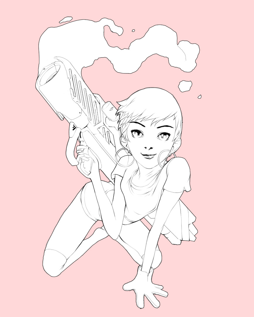
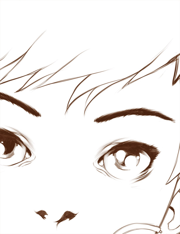
GOLEM | ROSABELLA FILAGONE
Some anticipations. Let me introduce you Rosabella. It's been a while since I did my last analog penciling work. In the gallery the original drawing I started from.
You can buy this work as an A2 Giclèe Ultrachrome print on Hanemuelhe 310g fine art ultra white rag paper (signed by the author) in the shop section.


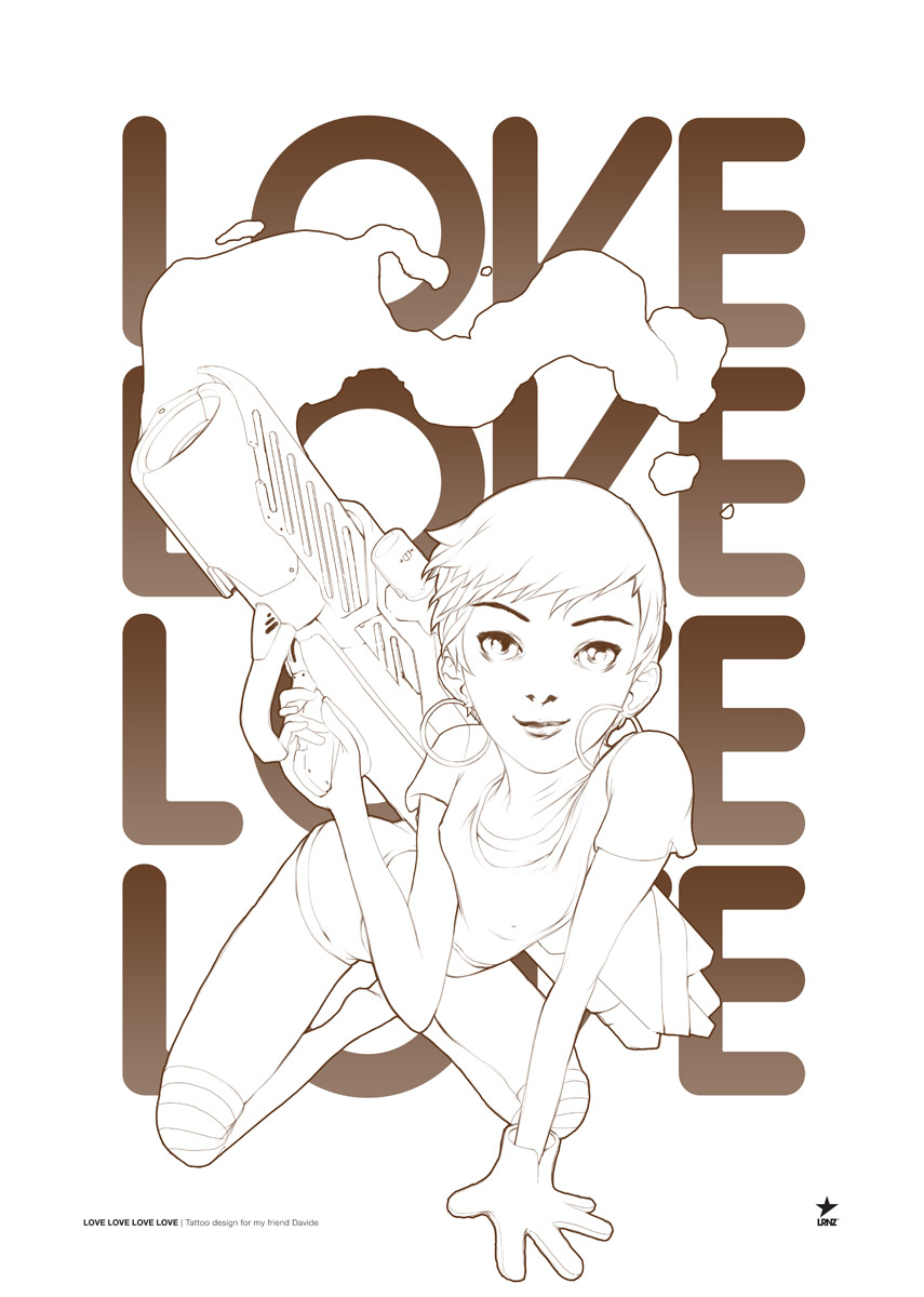
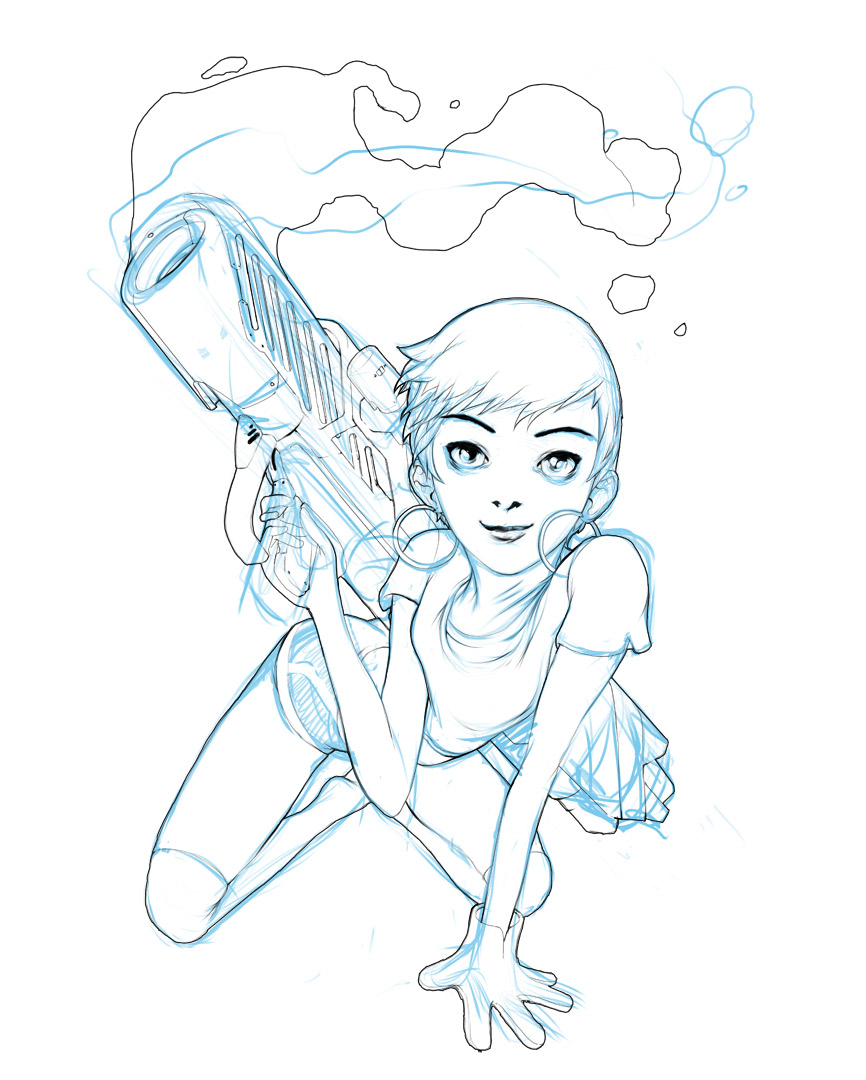
LOVE LOVE LOVE LOVE
LOVE LOVE LOVE LOVE
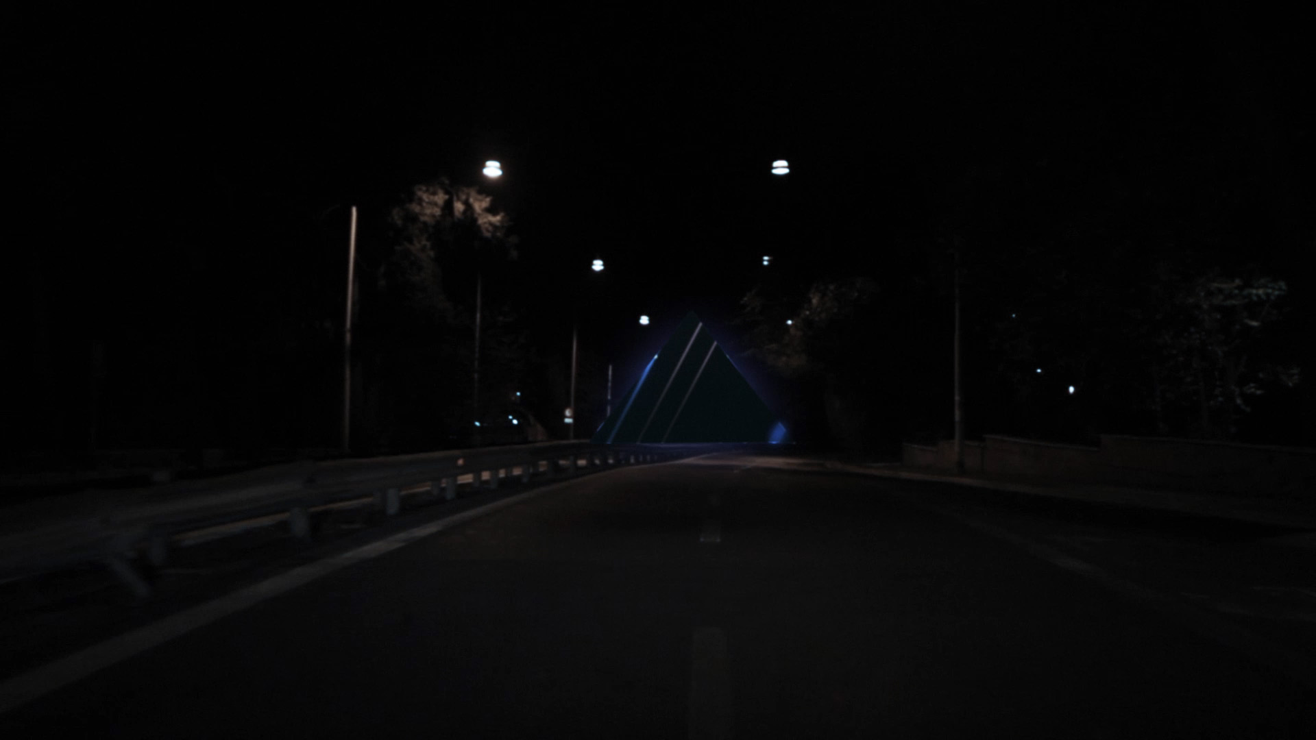
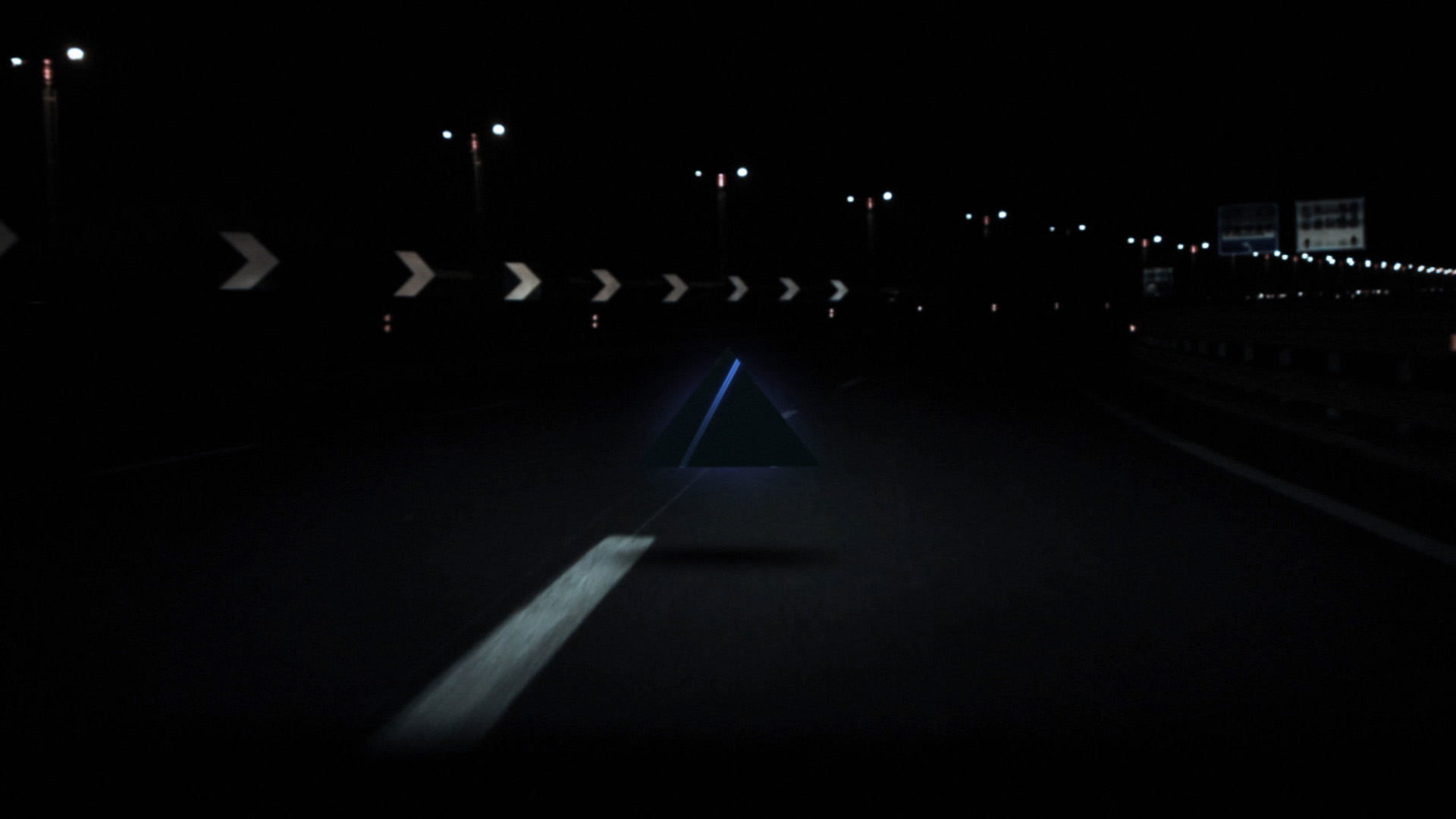
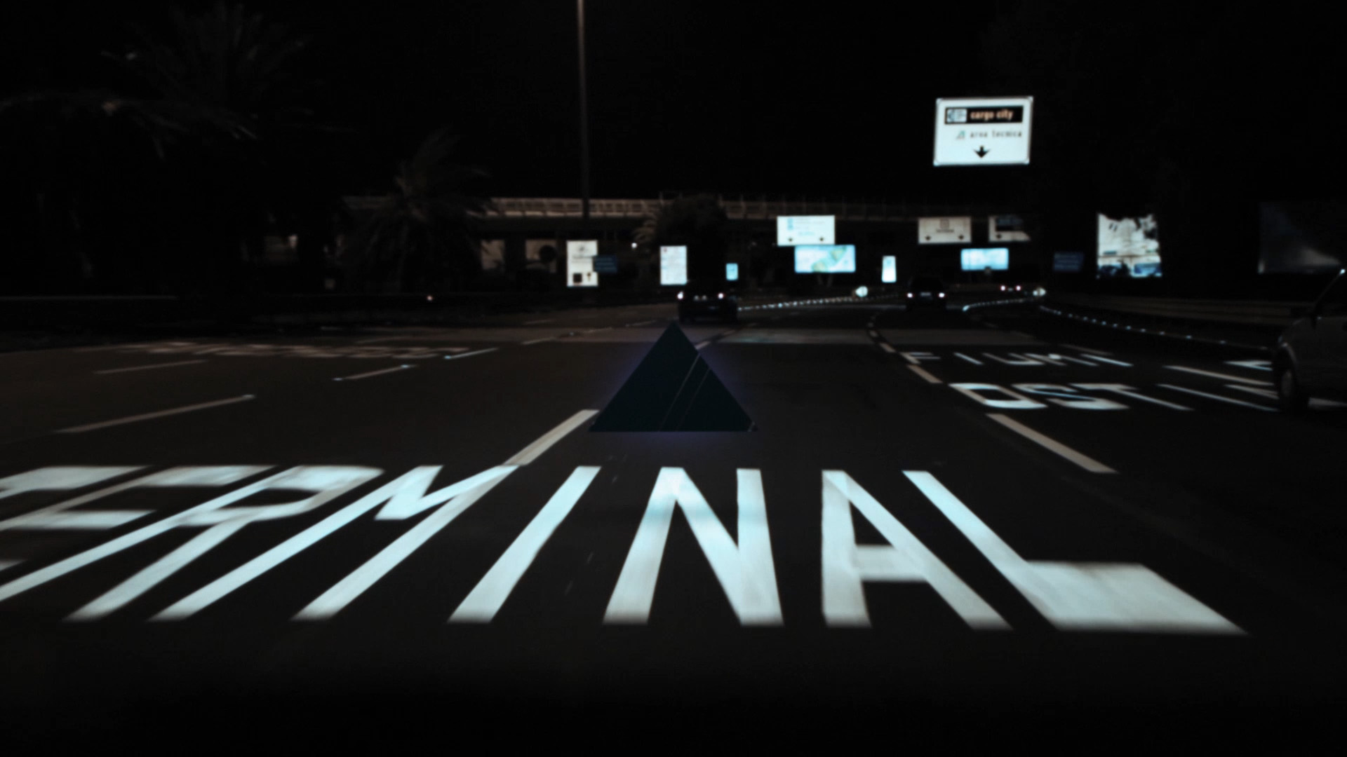
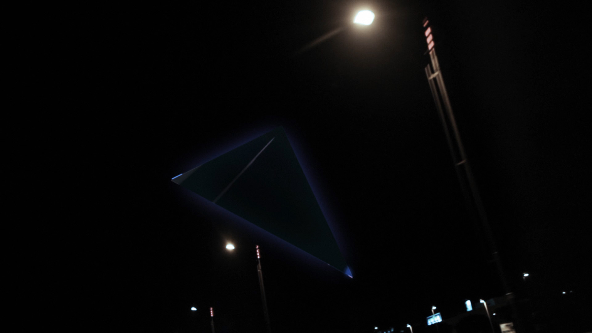
APPROACHING SECTOR X VIDEO
A quick visualization test for an old track of mine. It was the first monomachine + machinedrum only track i've ever made.
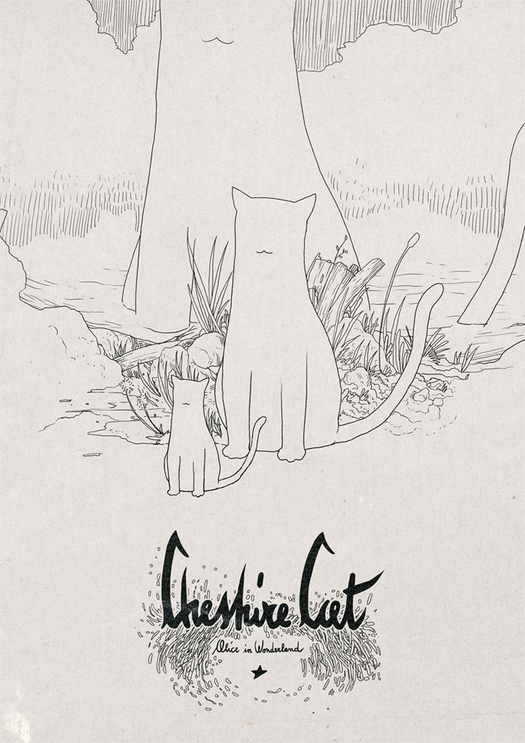
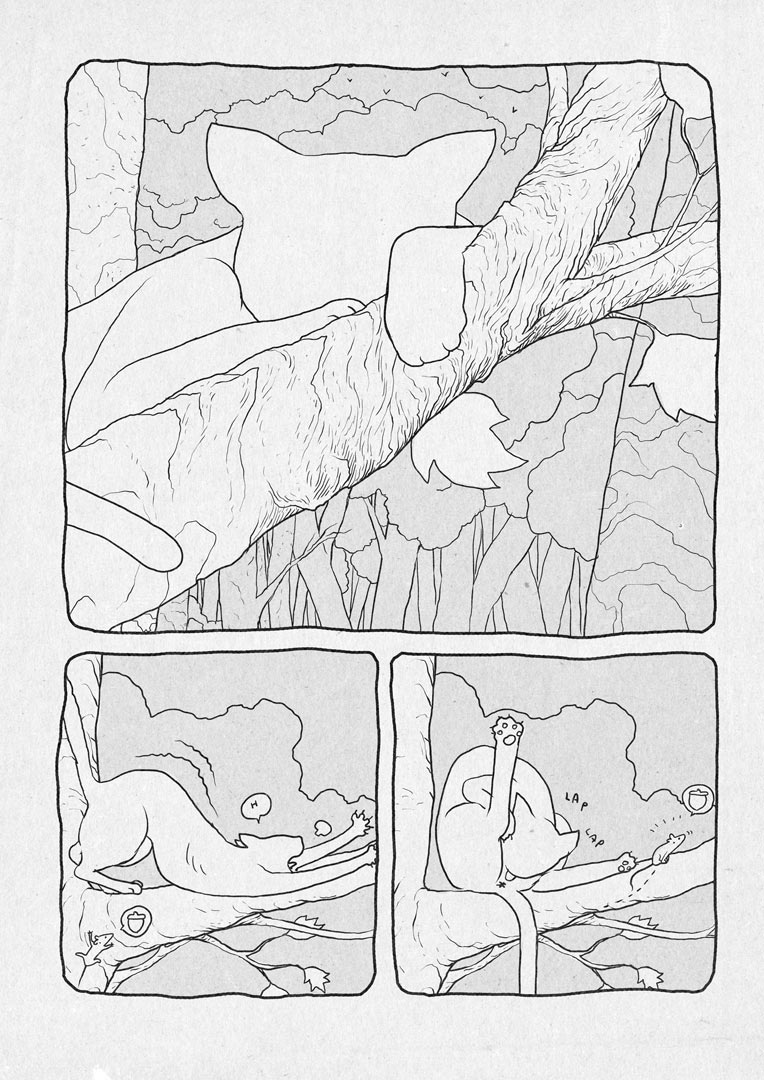
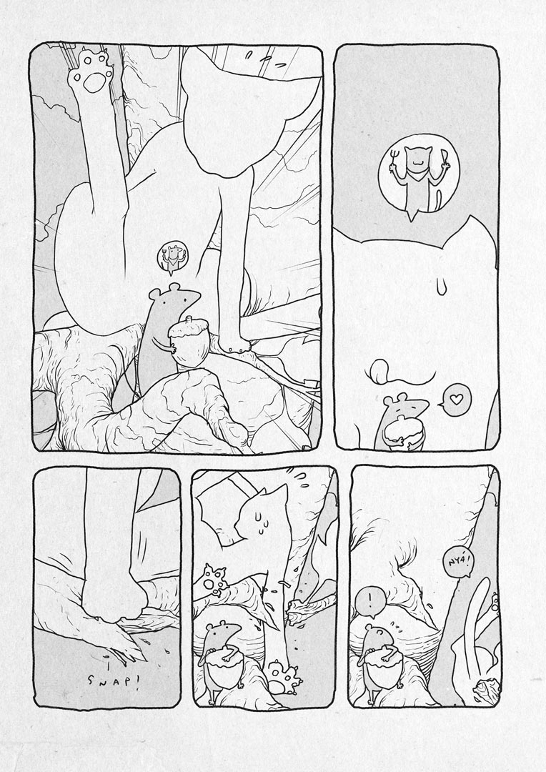
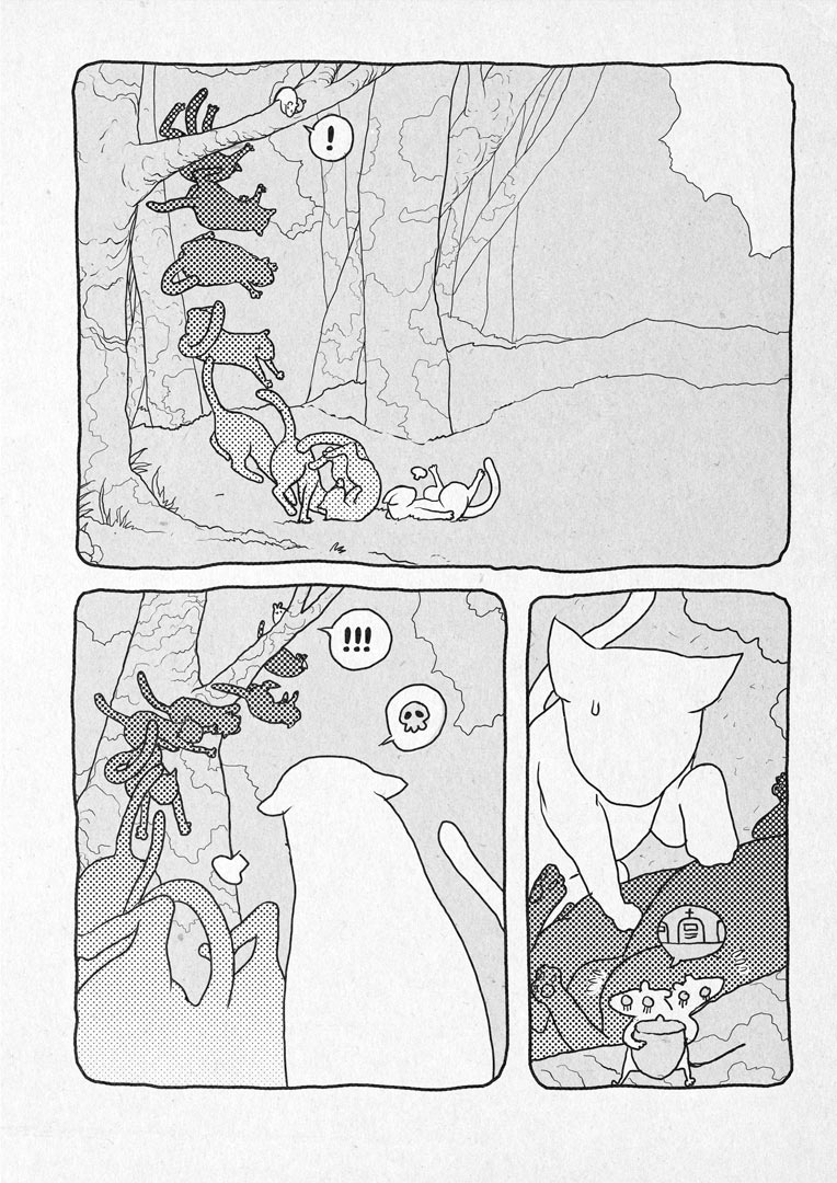
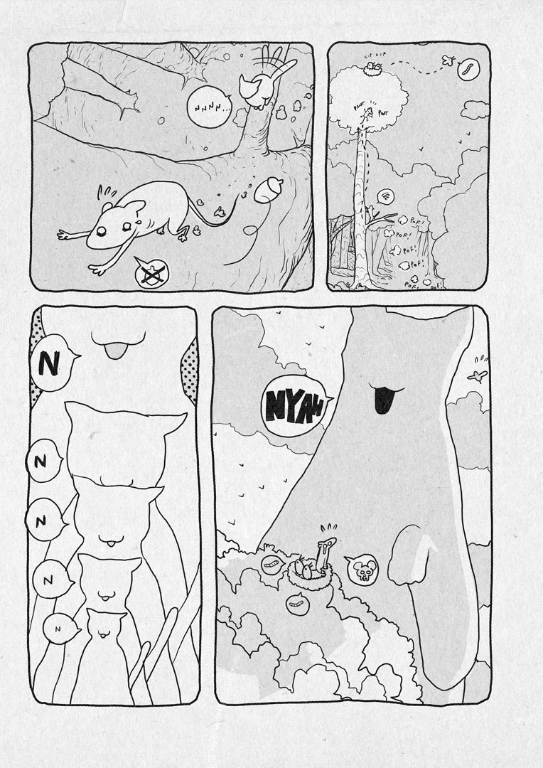
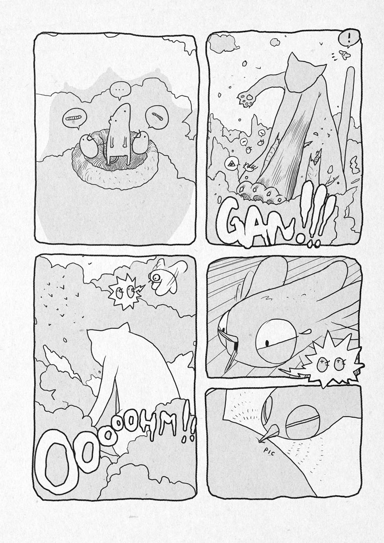
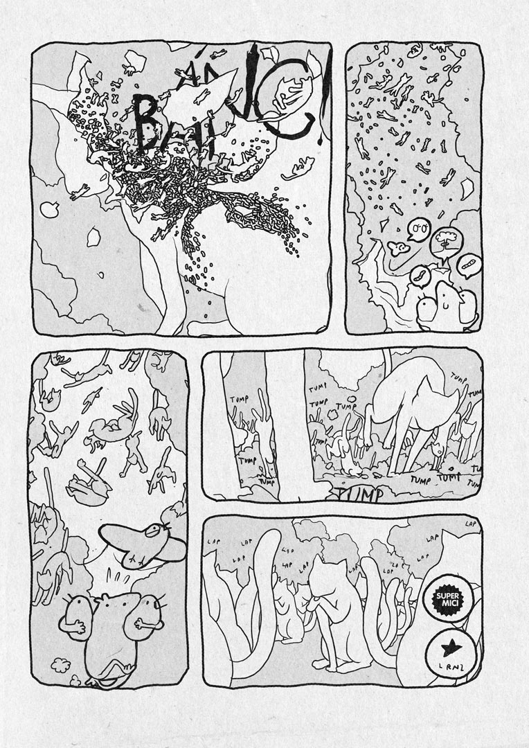
CHESHIRE CAT
My take on a super classic.
The book is called "WOnderland, wuando alice se ne andò", edited by Nicola Pesce editore.
It is an anthology about the life of wonderland inhabitants, without Alice.
Each character has it's own short story drawn by a different artist.
Hope you'll like it!

Finalfrontier | Logos and Idents


Complete set of logo redesigns for Nature, Finalfrontier and Pigna labels.

MIT MEET IN TOWN 2010


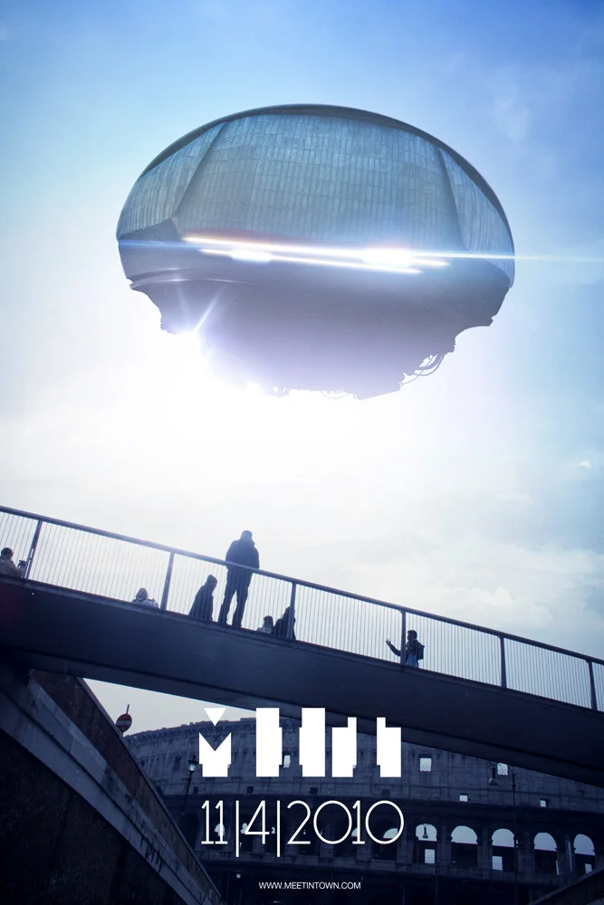
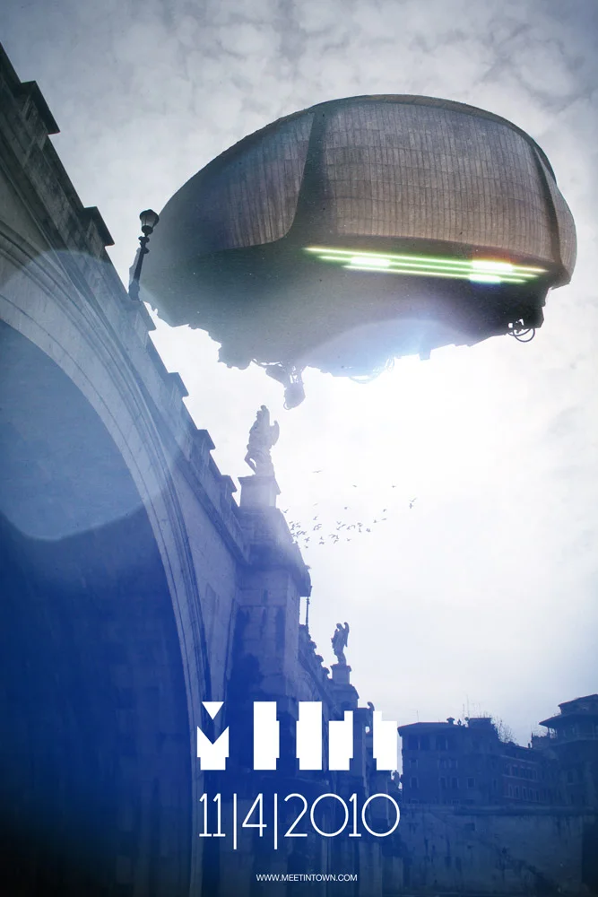
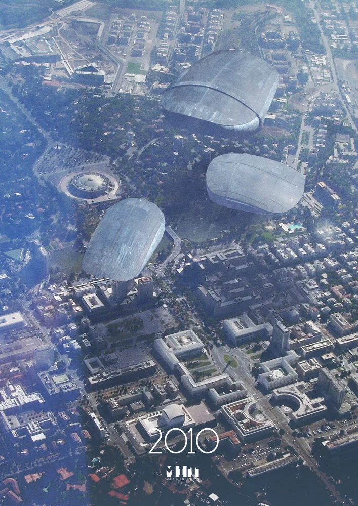
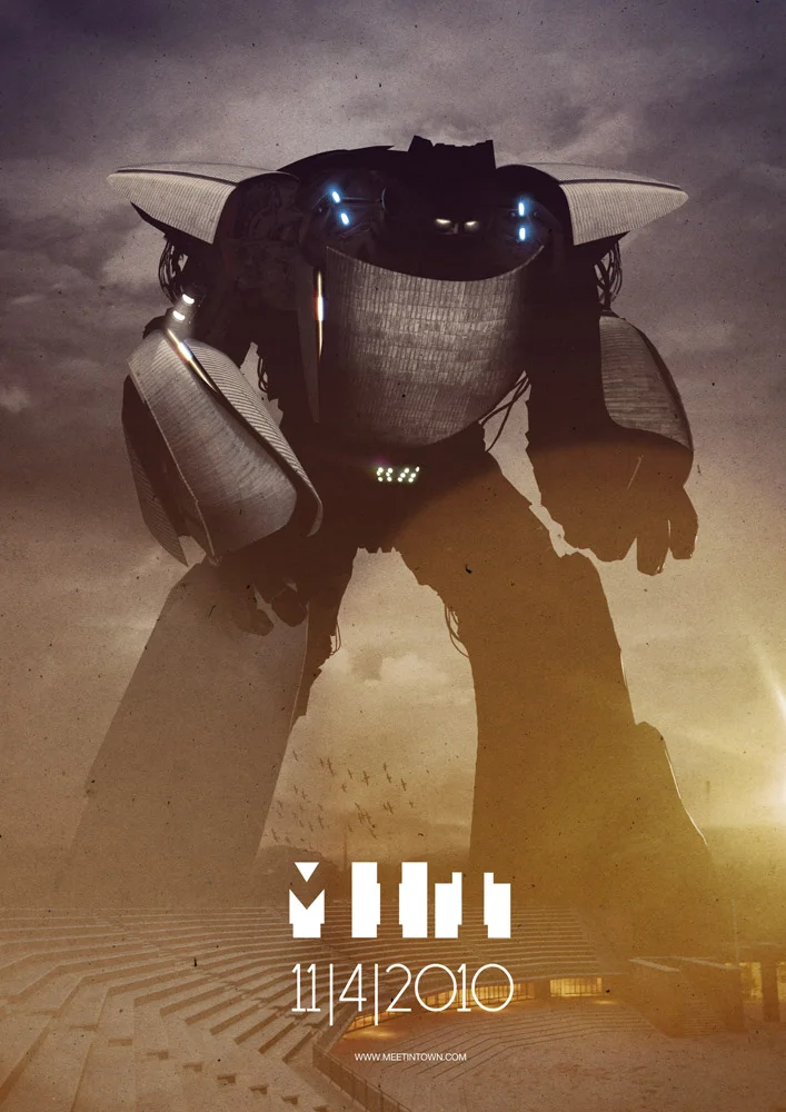
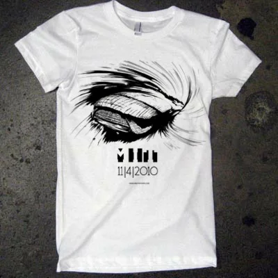

Ok I know: this is a borderline illustration work.It's more a illustration on photos process.I usually don't like people working with photos.
Still I want to share it on this blog.
It's my work for Meet in Town, a music festival in Rome.Xister involved me in the project as a creative director.
Honestly, I started working on it as a joke, but it did get dead serious in the end!The basic idea was to develop a 3 step communication process, a teaser, the evolution and the final images.
Each step is made of 3 images and three simple animations I made starting from the illustrations.
The concept is very easy: 3 huge mysterious objects are coming, one from the desert, one from the ocean and one from the sky (yes, it's a SENTAI tribute).Where do they come from and what are they coming for?
Then I got this idea to use the main auditorium structures as alien vessels and it was very fun to develop.Hope that Renzo Piano will have fun as much as I did.
I hope that after the whole set of posters is out, somebody will think of the real auditorium as a GIANT action figure set of a sci fi movie rather than modern architecture. Maybe it will look like a fake repro of my spaceships.
Moreover: you are actually going INTO those BIG spaceships - to party.
These are the first images, including some previews for the next round of illustrations. Enjoy!
Font by ADE Creative Studio!
You can buy this work as an A2 Giclèe Ultrachrome print on Hanemuelhe 310g fine art ultra white rag paper (signed by the author) in the shop setion. Set pricing available.

EVENT HORIZON
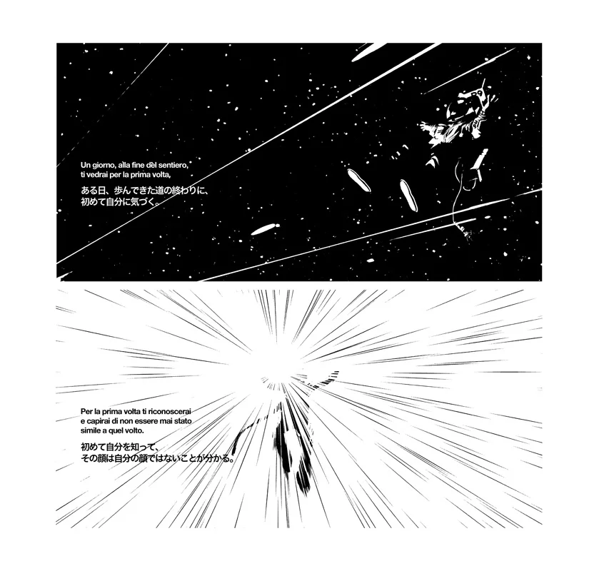
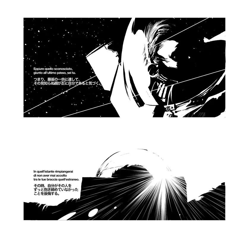
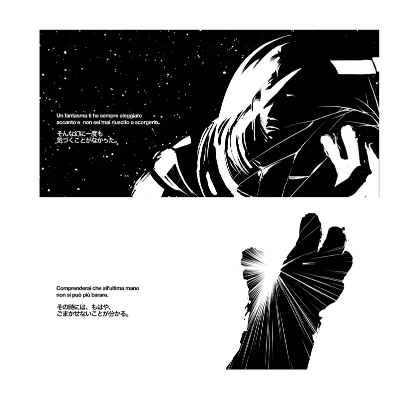
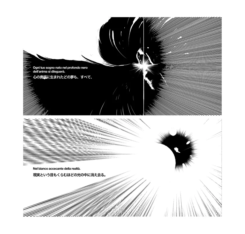

VERY VERY honoured to be selected for Futuro Anteriore 2010 (BLACK) at Napoli COMICON.
Event Horizon, my story, is about a lost spaceman that turns into a black hole, devouring the entire universe as we know it.
Event Horizon will be printed as part of the Futuro Anteriore 2010 book.
You can see the panels at Napoli Comicon.
Text by Alessandro Caroni.
Japanese Adaptation Federica Lippi.
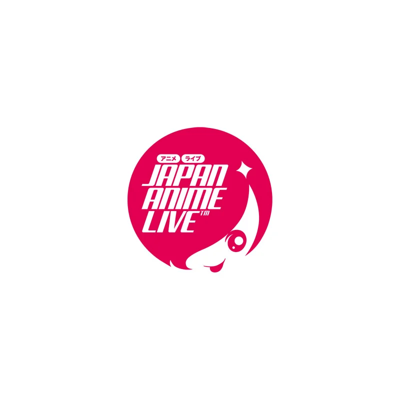
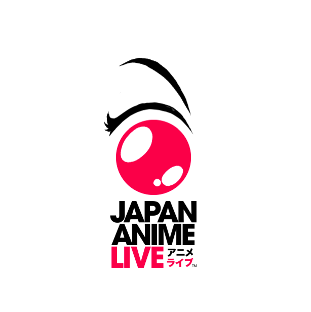
Japan Anime Live


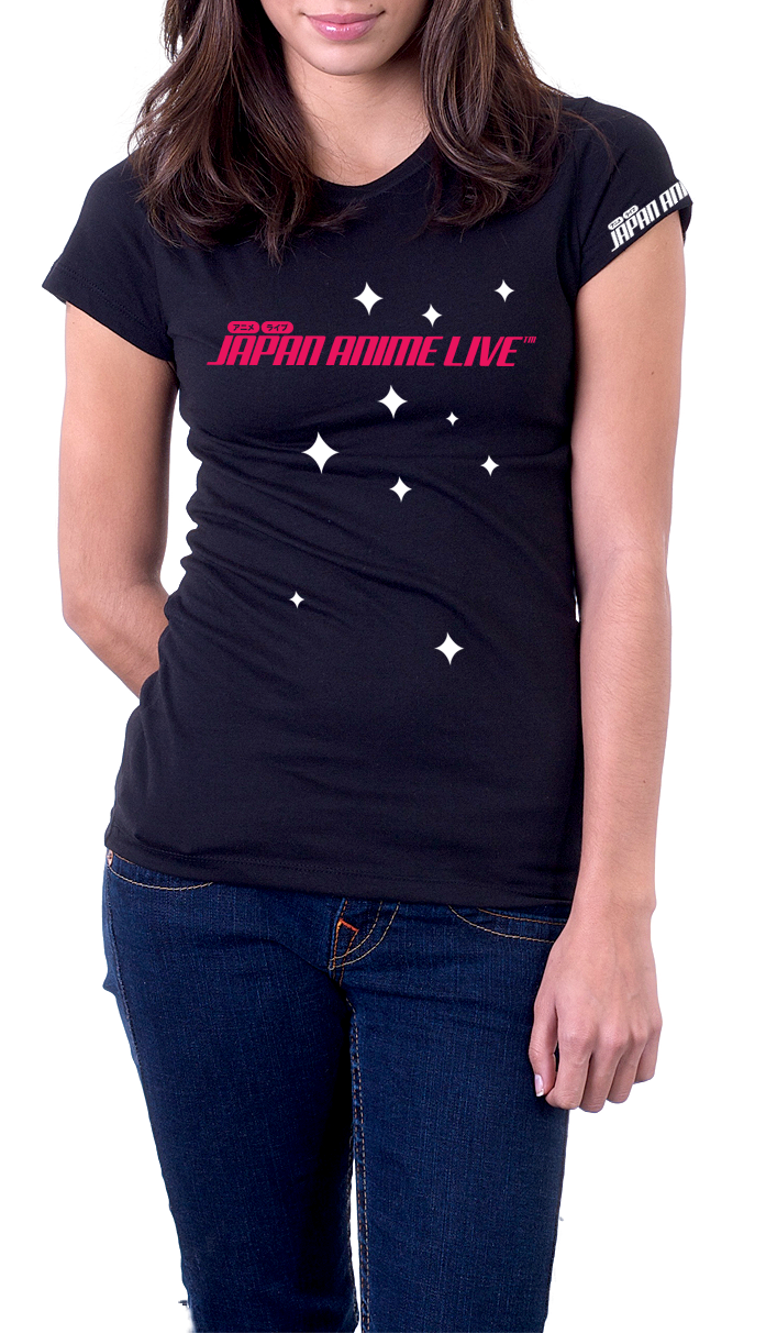

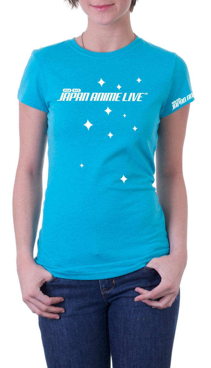
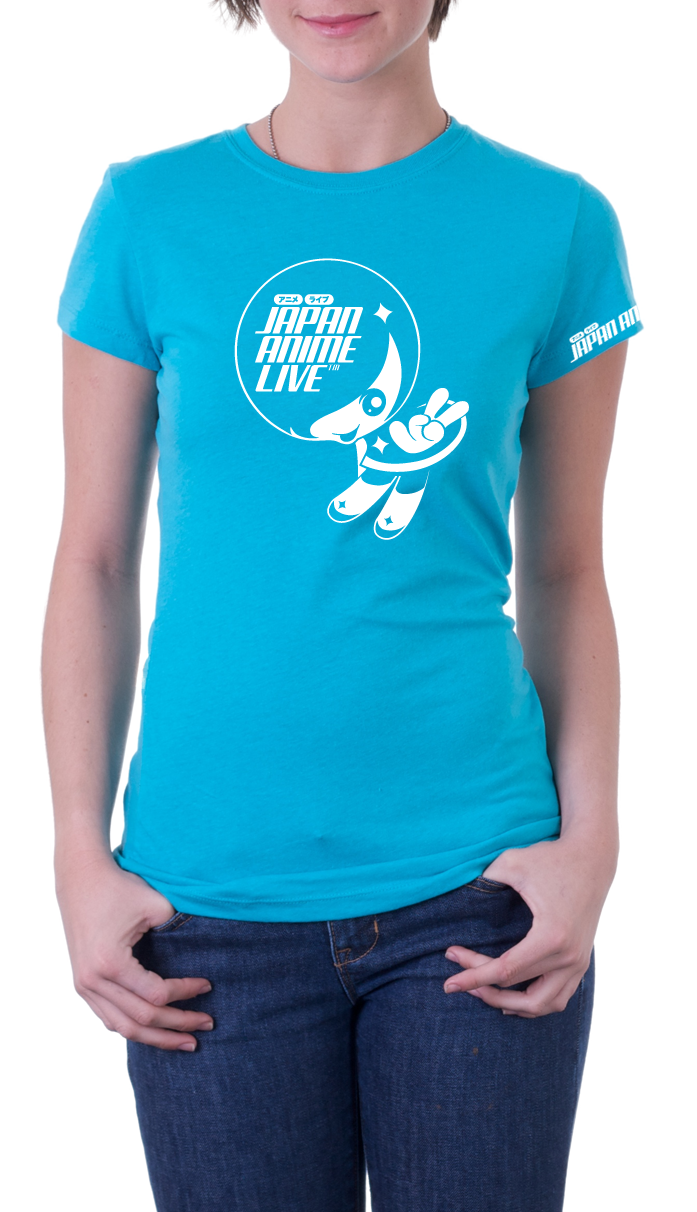
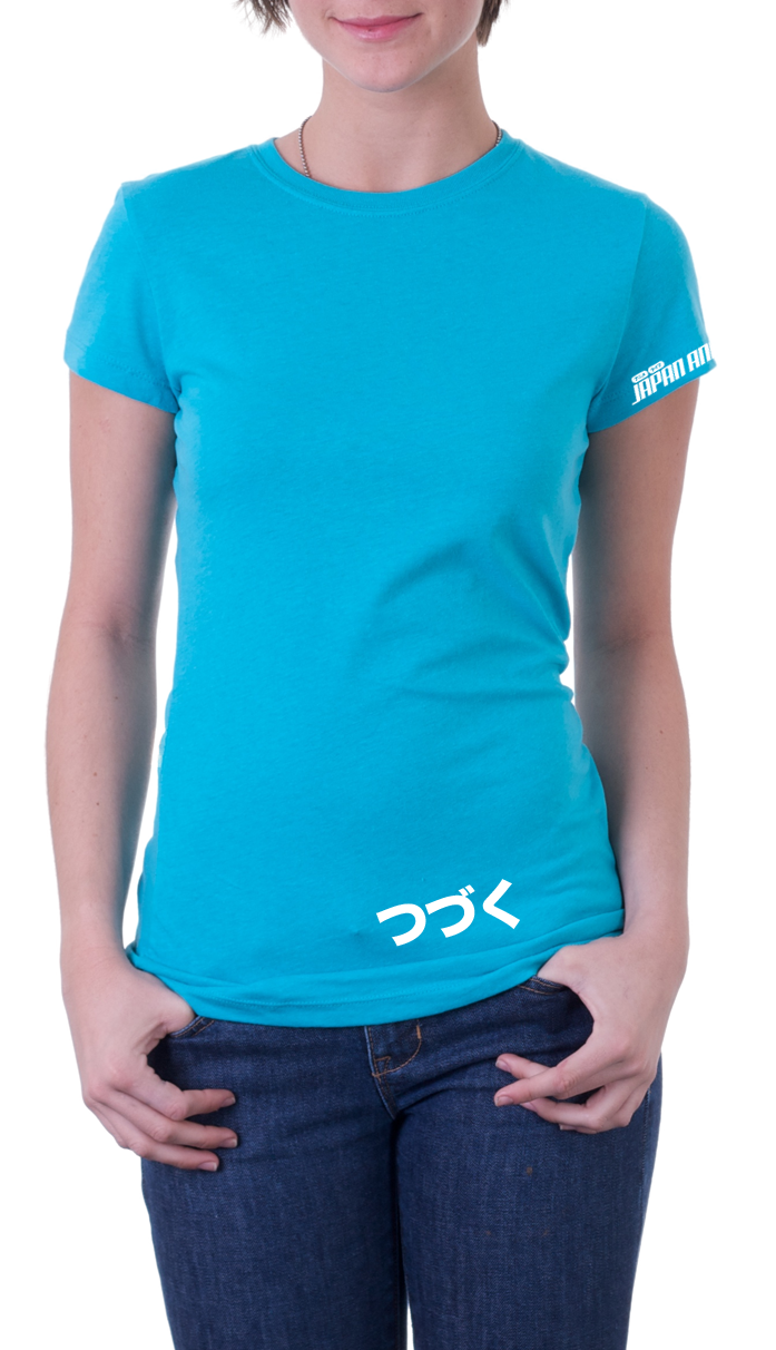
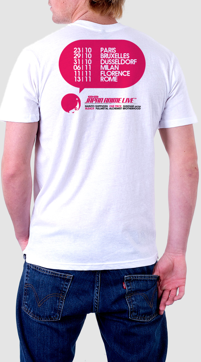
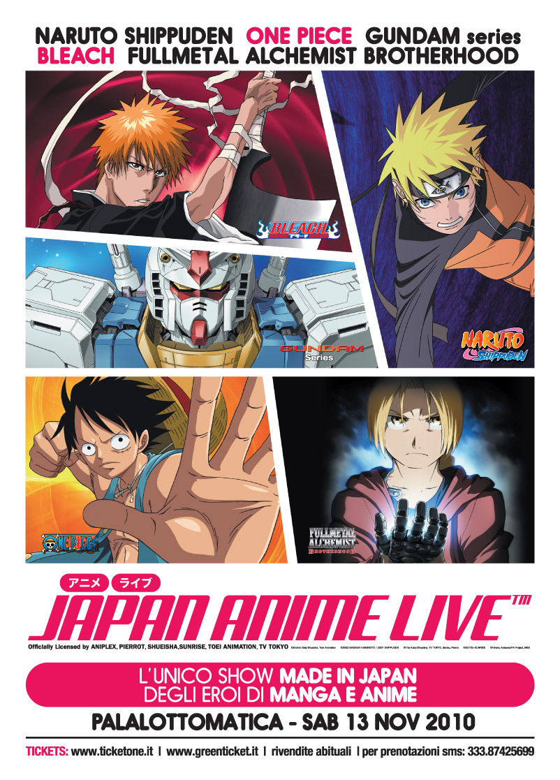
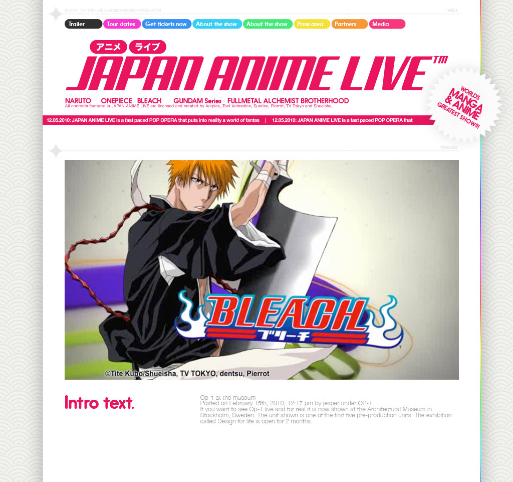
Designed this logo/mascotte for THE international Anime event, in collaboration with BANDAI, Shueisha, Studio Pierrot, SONY ANIPLEX, Toei Animation, TV Tokyo and Sunrise.
From their website:
The first and official live event made and performed by the Japanese creators of the famous Manga and Anime series WORLD PREMIERE – PARIS, Zénith - October 2010 The Greatest SHOW OF MANGA & ANIME ever conceived in the World. JAPAN ANIME LIVE is an extraordinary event that brings live on stage the “all-star” of the world of Japanese animation such as NARUTO-SHIPPUDEN, FULLMETAL ALCHEMIST BROTHERHOOD, BLEACH, ONE PIECE and GUNDAM Series. A unique show for the first time on tour in Europe. JAPAN ANIME LIVE is a mix of live action, live recitation, special stories, flamboyant effects and live music to sing along with the public the original theme songs of the TV series. JAPAN ANIME LIVE is a fast paced POP OPERA that puts into reality a world of fantasy and its heroes. A time-space gate that connects the fans with the dream world of Anime. A “must-attend” event for all cosplayers and Japanese pop culture lovers in general. JAPAN ANIME LIVE is what you will never watch on TV: in fact all animations and stories have been re-created and re-edited exclusively for the show and what’s more, they contain hidden facts about the stories of the beloved Anime characters. Over two and half hours of breathtaking show, divided into five chapters, each one devoted to an animated series, dynamically orchestrated by a script that combines all the different elements of the show. All contents featured in JAPAN ANIME LIVE are licensed and created by Aniplex, Toei Animation, Sunrise, Pierrot, TV Tokyo and Shueisha, which are the major JapaneseAnime-maker companies.
In the gallery below you can see some other discarded Logo drafts I made for the event.


QOOB ID3

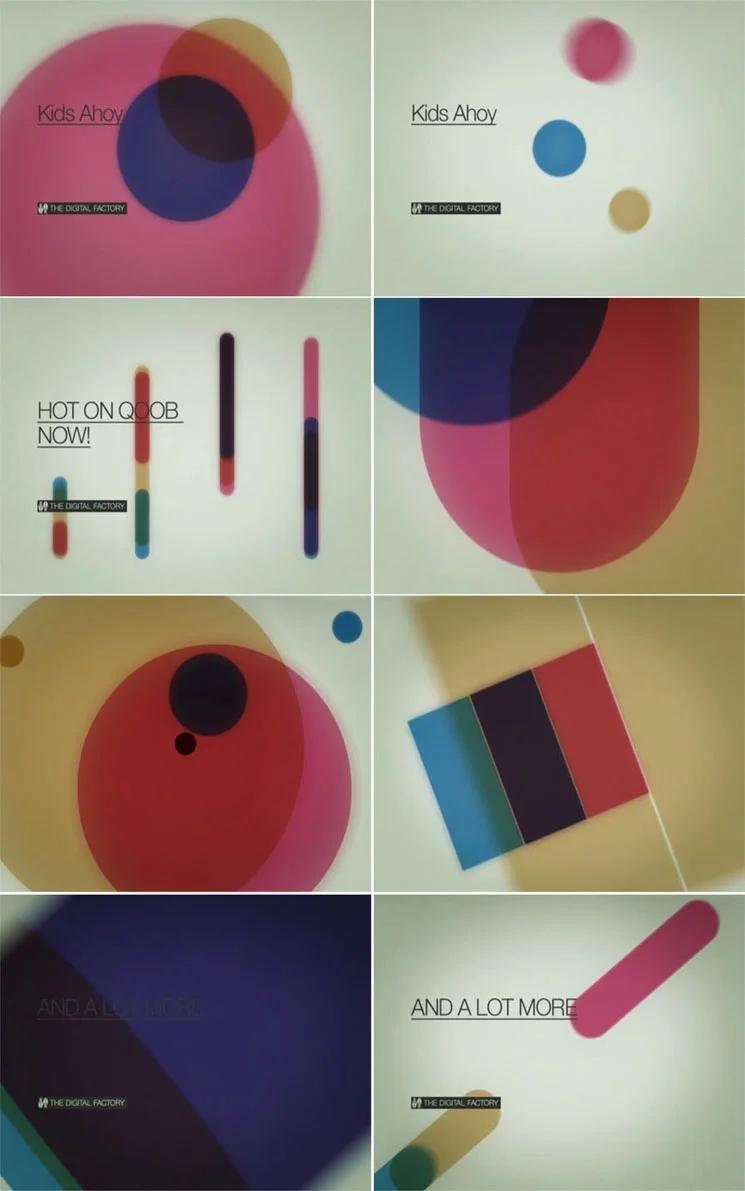
Doing this work was a real pleasure, as I had the chance to work again with my artistic stepbrother Gianluca Abbate, my colleague and inspiration during the Studio Brutus adventure. Gianluca founded his own Design Firm called ADE Creative Studio along with his old time friend and multitalented music producer Alberto Spezzaferro and worked since day one very closely to QOOB (first known as YOS and FLUX) producing anything they could need for a TV channel. It was a huge work. 2 years passed and they needed a new take on the QOOB identity. Gianluca and Alberto wanted me in for a new twist. I started my creative process trying to stay away from ADE past works for two reasons: it was SO good that I would never do anything better in the same style, change is a change so I tried to break every strong stylistic element ADE did build in two years of work, agreeing with ADE that the old ID grew so rich and without boundaries that it was almost impossible to find a true stylistic guideline.
So I started from the basic writing down a new corporate ID manual for QOOB, slightly altering the logotype structure and extabilishing the rule that changed the game: QOOB logo will not be animated anymore. It will only appear or disappear by unveiling using chromatic additive or negative tricks. I developed then the whole concept behind the typography system: web and TV now could use the same language. Happily used an underline custom version of Helvetica: good typograpy banned underline ornaments from design so it was impossible to have an underline text in a procedural web/video environment. Still I wanted it very badly: underlined linking is very specific of web visual language and being QOOB a user generated TV with a HUGE web based community it was a must to have it coded in their visual DNA.
Then I produced some draft concept videos that ADE presented to Lorenzo Banal (MTV art director) to explain the whole visual idea.
Concept was: from minimal/digital to basic/analog, with a strong back to the broadcast design roots flavour. Gianluca Abbate then did his job, and, as always, delivered the thing of beauty that QOOB ID3 is.
Here I will report directly from ADE Creative Studio webpage:
"At its third identity season refresh the Qoob.tv project, in perennial change, aimed at repositioning its brand so as to become a sort of production factory.
The project was coming of age and was ready to communicate also with an institutional audience, unlike at its first stage when it was mainly addressed to a young audience.
The new identity, created by Ade together with Lorenzo Ceccotti and under the supervision of Mtv and Qoob’s art director Lorenzo Banal, therefore abandoned all modular dissection strategies at the heart of all previous concepts and pointed instead on the solidification of the Qoob brand no longer dissectible nor transformable.
The task of unveiling the brand therefore lay in the additive and subtractive properties of colours with their closed essential geometrical shapes, a concept drawing inspiration from Swiss designer Josef Muller Brockmann’s early works of the 1960s.
As for the fonts, Thermo, planned by Lineto which embodied connotations no longer suitable for the dimensions was put aside in favour of a specially created variation of Helvetica Neue, much more versatile and suitable for the new needs.
Even the sound design shifted towards a softer and more electro-acoustic sound and for the first time a real Sound Logo was produced."
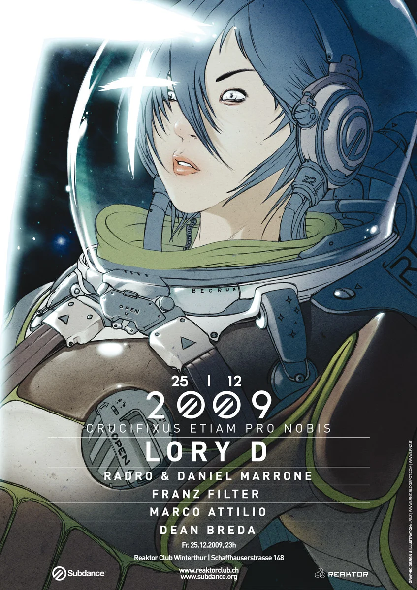
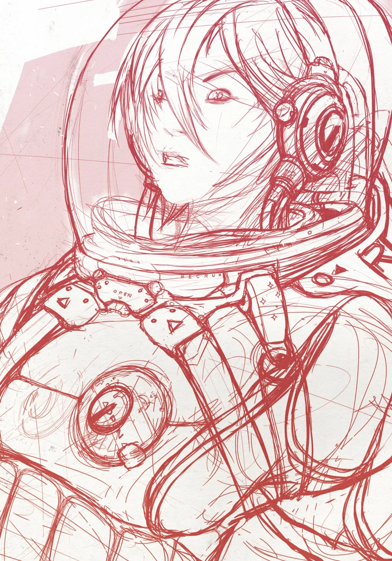
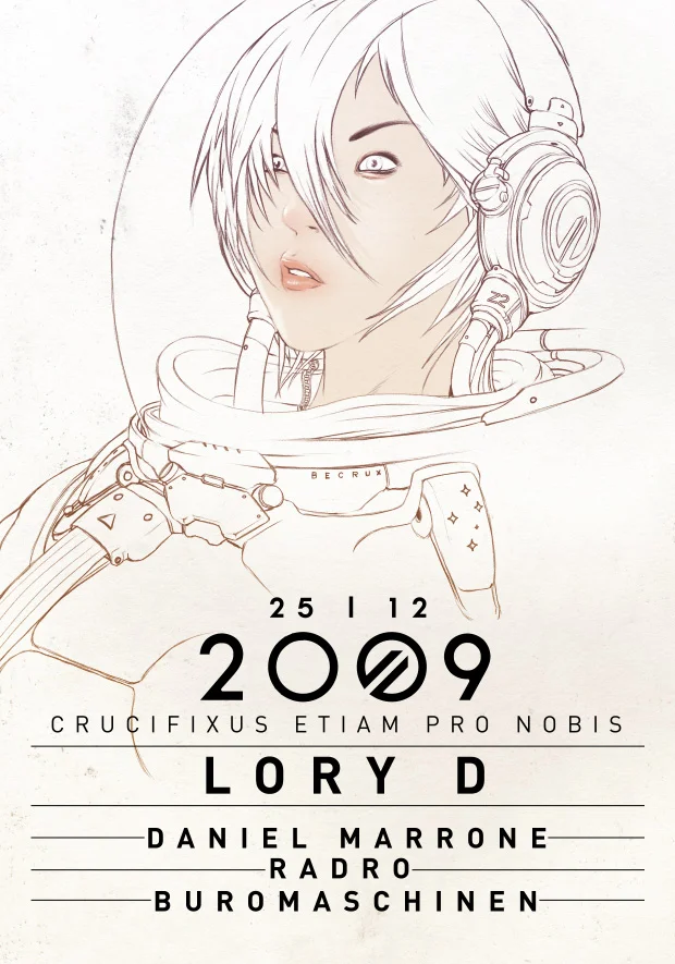
SUBDANCE CRUCIFIXUS ETIAM PRO NOBIS
My friend RADRO from Subdance Records asked me an illustration for a music event in Winterthur, switzerland. Here it is, a weird space encounter. It will be printed as a flyer and as a A2 Poster.
Below some in between steps!
You can buy this work as an A2 Giclèe Ultrachrome print on Hanemuelhe 310g fine art ultra white rag paper (signed by the author) in the shop.


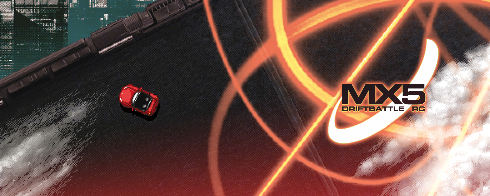
MAZDA MX5 DRIFTBATTLE RC
Developed as Chimp CO., my design studio back in 2004.
This small game was a promotional item for the MAZDA USA website. Was awarded with a monthly FWA as for being part of the zoom zoom island campaign. The game itself it's pretty original in terms of interface and control. You have to go through different kind of tournaments, each one with it's distinct rules, using the handbrake to make drifts combos and make your way to the top. Physics in the game are neat (we're speaking of flash MX2004). Graphics were mostly made on Cosmigo Pro Motion and Deluxe Paint IV on an amiga computer, still the best software ever for indexed pixel graphics. In the gallery below you can find some work in progress stuff.
It has an ugly bug as the game has an insanely difficult level at a certain point. Still featured multiplayer ghost racing action in 2004! Enjoy.
You can play it HERE. (if the game doen't show up refresh the page, some problems with hotlinking I think)
Graphics by LRNZ and Gianluca Abbate. Additional typography and main menu system graphic design by Marcello Crescenzi. Coded by Maurky and Maks. Music by Buromaschinen (hey it's me!), Abbskull, Mat64. Game design document (you can download it!) by LRNZ
ALAN1 | STAY FIT 2049
1964 AAU Teen Mr. America; 4th Place
1964 AAU Teen Mr. America Most Muscular, 5th Place
1969 IFBB Mr. America Tall, 40th Place
1970 IFBB Mr. America Tall & Overall, 4th Place
1970 AAU Mr. East Coast Tall & Overall, 4th Place
1971 IFBB Universe Tall, 3rd Place
1971 Beat Brandon Lewi for the Heavyweight Championship of the World
1972 IFBB Mr. International Tall, 4th Place
1972 IFBB Universe Tall, 4th Place
1973 IFBB Universe Tall, 3rd Place
1974 IFBB Mr. International Tall, - 4th Place
1974 GLAAD names Mike Katz the Man of the Century
1975 IFBB Universe Tall, 4th Place
1976 Mr. Olympia Heavyweight, 4th Place
1980 NBA Natural Mr. America Professional, 4th Place
1980 IFBB World Pro Championships Did Not Place
1980 Retired after losing to Cooper Hayman in the National Strongman Competition
1981 Mr. Olympia 15th Place
